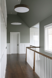
In the upstairs hallway, designer Laura Bohn juxtaposes medium-gray walls and white-painted poplar paneling and molding with medium-dark walnut floors and bannisters. Photograph by David Gilbert
Medium-dark walnut is not a hardwood I generally associate with beach houses—until I saw a new two-story weekend cottage in the Hamptons, New York’s favorite seaside resort. The project’s Manhattan-based designer, Laura Bohn, makes extensive use of the dusky wood throughout the interiors, which nevertheless look airy and light—as you’d expect of spaces used mostly in summer. Here’s how she does it.
Bohn conjures the spirit of Gretchen Dow Simpson’s iconic New Yorker covers—crisp architectural interiors and exteriors imbued with an attractive New England reserve—in the light-filled upstairs hallway. She painted the walls and ceiling Dovetail, a medium shade of gray that is one of her favorite colors, while using brilliant white for the poplar paneling, molding, and frames. The medium-dark stained walnut floor and bannister strike a rich, subdued note, giving what is a complex and dynamic space a pleasing sense of calm and unity without making it in any way heavy or somber.

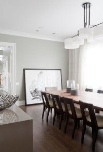
Walnut chairs stained dark espresso and a walnut table in a lighter shade join the dining room’s medium-dark walnut floor. Photograph David Gilbert
Bohn uses a lot of walnut in the dining room—dark-espresso stained walnut chairs, a lighter stained walnut table, and a medium-dark walnut floor—but keeps the space fresh and breezy by introducing a number of different surface textures. The pale gray walls have a low-luster eggshell finish that, the designer notes, has a slight sheen, “lending them a welcome degree of animation—something they would lack if the paint were totally flat.” The ceiling is painted bright white in a satin finish that also reflects the light, “giving the room a little sparkle,” as does the high-gloss lacquer on the elegant sideboard.

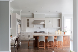
Stained lighter than the floor, the walnut kitchen island stands out like a piece of furniture. Photograph David Gilbert
In the kitchen, Bohn specified walnut for the floor and the island, but finished the latter in a lighter stain so it stands out like a separate piece of furniture. “But not too light,” she notes. “I made sure that the wood colors were within the same range.” The rest of the space is a serene composition of soft, subtle colors. The walls are pale gray and the cabinets are a putty tone rather than pure white, which the designer thinks would have been too severe: “The kitchen gets a lot of light,” she says, “so the cabinetry needed to be a soothing color.” Marble adds to the sense of calm: a lightly figured Carrara for the backsplash and a more boldly patterned Calacatta for the island countertop because “that’s the focus of the room.”
Laura Bohn Design Associates
122 West 26th Street, Suite 1204
New York, NY 10001
lbda.com

