A slatted or openwork screen can be a marvelous way to divide a room or create a defined space without making it feel claustrophobic. And if the screen or partition is made of hardwood, you get the beauty and character of the material as a decorative bonus. Here are three examples that I think work particularly well.

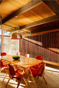
In Portland, Oregon, architect Risa Boyer designed a slatted solid-walnut partition to separate the dining area from the front entrance of a renovated midcentury house. Photograph by Lincoln Barbour
In renovating a midcentury post-and-beam house, Portland, Oregon–based architect Risa Boyer’s challenge was to make the remodel look and feel like it had always been there while adding modern conveniences. By removing some partitions and built-ins, simplifying the connections between the kitchen and living and dining areas, Boyer created a great room—a contemporary concept, but one that reflects how today’s families use their homes. In the process, a solid wall separating the entry from the adjacent dining area was torn down. In its place, Boyer inserted a custom slatted partition of her own design. Made of solid walnut, it not only screens the front door from the dining table but also complements the midcentury aesthetic perfectly.

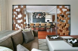
New York–based interior designer Betty Wasserman used hardwood blocks set in blackened-steel frames to create a spectacular pair of room dividers in a Greenwich Village loft.
Coffee tables, stools, and pedestals made of solid blocks of wood, fresh-sawn from the lumber mill, are a popular “rustic” touch in many sophisticated urban interiors. But New York–based interior designer Betty Wasserman takes cubes of hewn hardwood to a new level with a pair of custom room dividers she created for a stylish Greenwich Village loft. Comprising checkerboard-like lattices of wood blocks set in blackened-steel frames, the screens sit on either side of a wide opening between the living and dining rooms. Set against the interior’s tailored furnishings, unique lighting, and beautiful hardwood floor, the screens have a monumental yet light-as-air presence that perfectly balances the massive blackened-steel fireplace and stunning Joel Perlman sculpture at the far end of the dining room.

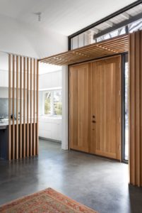
White oak is used for the kitchen screen, interior portico, and rift-sawn plank doors in the entry of an Austin, Texas house by architect Tim Cuppett. Photograph by Whit Preston
New construction gives a designer complete control over the use of interior screens. Such is the case in a house architect Tim Cuppett recently designed on a tree-covered site in Austin, Texas. In a comparable situation to the Portland house above, the kitchen is immediately adjacent to the front door. Cuppett used this positively, separating the open kitchen from the entry with the most elegantly minimal of screens: nine slender, widely-spaced white-oak slats that rise from floor to ceiling at one end of the breakfast counter. A similar structure of white-oak slats forms a delicate interior portico above the double front door, which is made of rift-sawn planks in the same wood, as is the board-and-batten wall flanking the other side of the doors. All in all, it’s a serenely harmonious composition that creates a warm welcome.
Risa Boyer Architecture
1001 SE Water Avenue, Suite 230
Portland, OR 97214
www.risaboyer.com
Betty Wasserman Arts & Interiors
236 West 26th Street, Suite 602
New York, NY 10001
www.bettywasserman.com
Tim Cuppett Architects
4300 Marathon Boulevard
Austin, TX 78756
cuppettarchitects.com


