… Especially when it’s time to refresh and revitalize dull and flat looking interior spaces. In a recent Wall Street Journal article, “Color the Lines,” freelance journalist, Yelena Moroz Alpert, spoke with the pros for their take on adding color as, “the swizzle that transforms interiors with the whisk of a paintbrush.”
- New York interior designer Tara McCauley upgraded her apartment by underscoring pale aqua walls with teal-blue baseboards.
- To unify architectural elements and to bring continuity and calm to a study, interior designer Nicole Salvesen, of London’s Salvesen Graham, carried a bubbly blue across a fireplace mantel, wainscoting, built-in shelves and windows.
- Instead of using semi-gloss, which is the standard finish for painted architectural woodwork, interior designer Marc Goldberg, founder of firm Interiors Matter, used lustrous jet-black pigment against snowy matte walls in his New Jersey house. “High gloss adds drama,” he says, “and it’s that glossy, lacquered finish that puts it over the top.”
- Philadelphia interior designer Glenna Stone pulls trim color from art, a rug or a pillow for cohesiveness, and sees contrasting trim as a way to differentiate your interior.
So, if you need to make a lackluster space POP, never underestimate the power of color. It makes the world go round, as they say. And it’s an effective and fun way to reinvent a space, without breaking the bank.
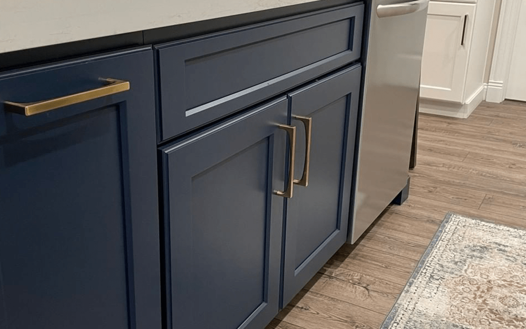
Photo by Forever Cabinets by Kendrick


